I don't even know where to start with this post. The saga began in August.
The outside of our house was getting very faded and in some places the exposed wood was beginning to rot. The time was well overdue to have the house painted. I don't think it had ever been painted since it was built around 2005.
Once I got the go-ahead from Guv'nor, I contacted three local painters. I've always heard you should get three quotes. I knew nothing about the first one. I had seen a sign on the road with a phone number. The second one had done some painting for us when we did the remodel soon after we arrived. The third one was a recommendation from a neighbor. I eventually contacted all three.
The first one came as planned, arrived on time, and did not get lost. We communicated easily, he seemed confident he could do all the work, and he gave us a thorough handwritten estimate. Sounded too good to be true. (This is why you get three estimates.)
The second one came as planned, didn't get lost because he lived just down the road. Unfortunately he wasn't as easy to communicate with and admitted he couldn't do part of the job (replacing rotting wood trim, treating the wood deck). I had to ask for a written estimate and he jotted down some numbers on a scrap piece of paper. The numbers were at least double from the first, plus didn't include the entire job.
The third one didn't work out. When I tried to contact him, we could not communicate at all because of a language barrier. He never followed up and I lost interest.
So, it's not a big surprise that we went with the first guy. He did give me a few references, which all turned out positive.
By the time we got on his calendar, it was mid-October. So there's no real excuse why we hadn't done our homework better on paint colors. We knew what we liked: the original house color that we had seen when we first saw the house six years ago. But even then, it was probably already beginning to fade. To our eye, the house color was always a shade of green. So we began looking at greens on the Sherwin Williams color wheel, and chose one called Clary Sage. We also had to choose a trim color (Dover White) and a deck color (Mahogany).
The painter arrived on the scheduled day, nice and early, and caught me off guard. He was clearly ready to get started. He quickly started pressure washing, which meant all the outdoor furniture around the house had to be moved. By me. Thankfully the Factor was here at the time and jumped in and took over. He even took down our Christmas lights (yes, we're those annoying people who keep their unlit Christmas lights up year round).
The next few days he caulked in the gaps and papered the windows. It was nice progress even with a couple of off days due to the wind or chance of rain. Soon after he had the trim painted and had started in on the house color and got about 3/4 around the house.
When the weekend rolled around, Guv'nor had his first chance to see the house color in the daylight. I admitted freely that the color wasn't quite right, but I was happy enough with it. Guv'nor thought it was the wrong color, a bit too pastel looking, and suggested we get a few alternative sample colors painted on the unpainted section.
If you've never chosen paint colors, then you probably won't be able to sympathize with the rest of the story. So just stop reading right now.
We chose three more colors: Artichoke, Evergreen Fog, Austere Gray, and had a small section painted. It was about this time that we realized the colors in the paint wheel did not translate to the same color on the outside of our house. As it was explained to me, there are too many variables - paint types, surface texture, lighting, surrounding colors - all which affect the overall color. So it is essential to get samples painted on actual walls.
Artichoke was the color we decided on the second time around. It was a pleasant color, but one shade darker than Clary Sage on the color strip. I'm still not sure why we thought this was a good idea. Maybe that it would fade to the right color over time? The whole house got painted before we came to the sad conclusion that it was still not the right color. There was something wrong with the contrast between the darker green and the cream trim. It reminded me of a Christmas cookie. Maybe we should have just painted the trim darker. It's funny that you can quickly tell what is wrong, but much harder to tell what is right.
We could understand now why some people hire a designer to choose paint colors.
Thankfully we finally realized that the color we actually liked wasn't a green at all, but a gray. We just thought it was a green because that's what it looked like to us with the green tinted windows and the trees and grass around it.
We chose more three colors: Austere Gray (had tried this before but it looked different), Unusual Gray, Escape Gray. At least they sounded more promising. We also had the painter paint a larger sample on the side of the house. One turned out to be too pale. One turned out a touch too blue. But one, thankfully, turned out to be a very close match to the original color. It was called Escape Gray.
I never would have guessed that we would painted our house gray. But here are the photos to prove it.
 |
| The goal was to get the house back to the original color from 2012. |
 |
| The pressure washing was done in a couple hours. |
 |
| The deck and brick pavers were pressure washed. |
 |
| After pressure washing. Parts of the house looked yellow. |
 |
| The garage door hadn't faded as much as the rest of the garage. |
 |
| The Factor taking down our Christmas lights. |
 |
| It took several days to do all the caulking. |
 |
| Paper was taped to the edge of the trim. |
 |
| Some windows were completely covered with paper. |
 |
| Thankfully we could still see out the front door. |
 |
| In addition to paper, thin plastic was used to cover the windows. |
 |
| Any area that might be near the painting got covered. |
 |
| Even the door bell switch got taped over. |
 |
| The door knobs and the thresholds were covered. |
 |
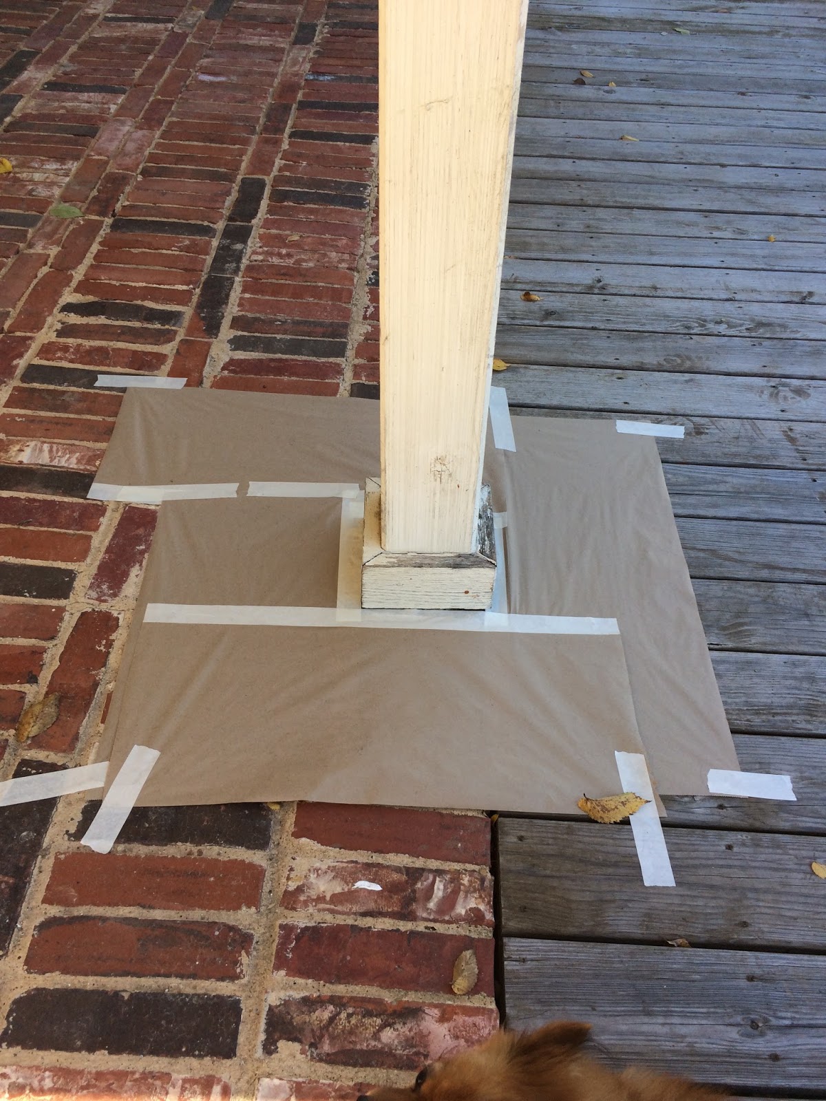
| The pillars got covered. |
 |
| The trim got painted first. |
 |
| Here is a glimpse of Clary Sage. |
 |
| Close up view of the first color. |
 |
| The a couple of sample colors up next to the Clary Sage. |
 |
| Top color is Artichoke, bottom color is Evergreen Fog |
 |
| Artichoke being painted over Clary Sage. |
 |
| A corner of each color - the first one and the second one |
 |
Here's the Christmas cookie affect I could see.
|
 |
| To be fair, the Artichoke looked okay from a distance. |
 |
| Close up view of the second color. |
 |
| The last three colors were painted on the side of the house next to the Artichoke, stonework and roof. |
 |
| Different time, different angle gives different looks. From left to right: Escape Gray, Austere Gray, Unusual Gray |
 |
| Holding up the color wheel strip next to the painted wall. This is Escape Gray. |
 |
| This is Austere Gray on the wall. |
 |
| Because the garage doors are metal, the color looks different. |
 |
| We finally got the contrast with the colors of the pillars, brick and door that we liked. |
 |
| Close up view of the third color |
 |
We're happy in the end.
|


This comment has been removed by a blog administrator.
ReplyDelete